
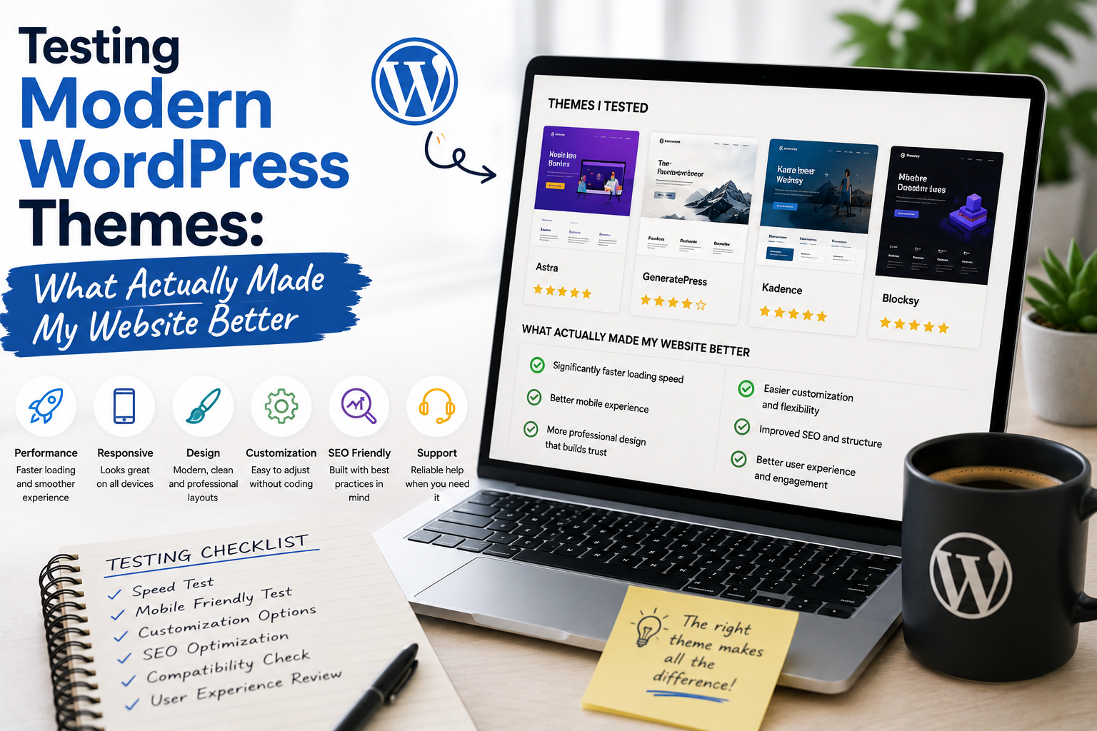
When I first started experimenting with WordPress themes, I made a fairly common mistake: I judged them almost entirely by appearance.
If a theme had a beautiful homepage, modern typography, attractive buttons, and impressive demo pages, I assumed it would automatically make my website better.
After testing several modern WordPress themes, I discovered that appearance was only one part of the equation.
Some themes looked fantastic but made everyday management unnecessarily complicated. Others had simpler designs but improved my workflow considerably.
This is what I learned from testing them.
My Goal Was Not Just a New Design
I did not want to change my theme simply for the sake of having something different.
My goal was to improve the overall website experience.
I wanted a theme that made it easier to organize content, adjust layouts, create navigation, improve readability, and maintain the website over time.
That changed the way I evaluated themes.
Instead of asking, “Does this look good?” I started asking, “Does this actually make my website better?”
The First Thing I Tested Was Customization
Modern WordPress themes can provide extensive customization options.
Depending on the theme, I could adjust typography, colors, spacing, layouts, headers, footers, menus, and other design elements.
This was one of the most useful improvements I noticed.
I no longer needed to make small changes manually whenever I wanted to adjust the appearance.
Block themes also provide access to WordPress’s Site Editor, allowing users to customize areas such as templates, styles, headers, footers, and other site components.
For me, flexibility became much more important than having dozens of decorative features.
I Discovered That Typography Matters
One surprisingly important improvement was typography.
A theme can have an attractive layout, but poor font choices or uncomfortable spacing can make reading difficult.
After testing several themes, I paid more attention to:
- Font size
- Line height
- Paragraph spacing
- Heading hierarchy
- Text width
- Mobile readability
A simple typography improvement made some websites feel significantly more professional.
This taught me that good design is often about small details rather than dramatic visual effects.
Mobile Design Was Essential
Another area I tested carefully was mobile responsiveness.
A website can look excellent on a large desktop screen but feel completely different on a smartphone.
I checked menus, images, headings, buttons, columns, and content spacing on smaller screens.
This became one of my most important theme-selection criteria.
A modern theme should provide a comfortable experience across different screen sizes.
The website does not need to look identical everywhere.
It needs to remain easy to navigate and read.
Page Speed Changed My Opinion
This was one of the biggest lessons.
Some themes looked impressive because they included numerous visual features.
But I learned that every additional feature can potentially add complexity.
A website’s performance depends on many factors, including the theme, plugins, images, hosting environment, and configuration.
As a result, I started preferring themes that provided the features I actually needed without unnecessary extras.
A clean and efficient theme often gave me a better experience than an overloaded one.
I Tested Plugin Compatibility
My websites already used various plugins, so compatibility was another important factor.
A theme should not be evaluated in isolation.
It has to work with the rest of the WordPress environment.
I checked whether menus, forms, widgets, content layouts, and other website components continued to function correctly after changing themes.
This also taught me to create a backup before making major theme changes.
Testing is much less stressful when there is a recovery option.
Navigation Made a Bigger Difference Than Expected
Another feature that genuinely improved my websites was better navigation.
A modern-looking menu is nice, but usability matters more.
I tested whether visitors could easily find categories, important pages, articles, and other content.
A clean navigation structure made the website feel more organized.
This was a reminder that themes should serve visitors rather than simply impress website owners.
I Stopped Chasing Too Many Features
During my early testing, I was attracted to themes with enormous feature lists.
Eventually, I realized that many of those features were irrelevant to my websites.
I started making a simple list of what I actually needed.
For example:
Responsive design + good typography + flexible layouts + reliable navigation + customization + regular updates
If a theme handled those requirements well, it was already a strong candidate.
Updates and Maintenance Became Important
A theme is not a one-time purchase or installation.
It needs to be maintained.
Before choosing a theme, I now check whether it appears actively maintained and whether documentation is available.
WordPress provides tools for managing installed themes and receiving theme updates when updates are available from their authors.
This gave me a better appreciation for themes that are actively developed.
The Demo Is Only the Beginning
Another important lesson was not to judge a theme entirely by its demo.
The demo represents what the theme can look like under a particular configuration.
My website has different content, images, plugins, and goals.
Therefore, I began evaluating themes based on how easily I could transform the default design into something suitable for my own project.
That is a much more useful test.
The Features That Actually Made My Website Better
After testing different modern themes, several features consistently stood out:
Responsive layouts made mobile browsing easier.
Flexible typography improved readability.
Simple customization saved time.
Good navigation made content easier to discover.
Clean layouts reduced visual clutter.
Reasonable performance created a better visitor experience.
Regular updates made long-term maintenance easier.
These improvements were more valuable to me than flashy animations or enormous collections of decorative elements.
Where to Download WordPress Themes
For free themes, I recommend starting with the official WordPress Theme Directory.
Download WordPress Themes from WordPress.org
It is a safer starting point than downloading theme ZIP files from unknown websites.
If you want a premium theme, download it from the official developer or an authorized marketplace where you purchased the theme.
I would avoid “nulled,” cracked, or unofficial premium themes because the files may have been modified and can introduce security or maintenance problems.
Final Thoughts
Testing modern WordPress themes changed the way I think about website design.
I used to believe that the best theme was the one with the most impressive demo.
Now I believe the best theme is the one that improves the actual experience of managing and visiting a website.
A good theme should make your website easier to read, navigate, customize, maintain, and use—not simply make it look impressive in a screenshot.
The biggest improvements I found were not necessarily the most dramatic ones.
Better typography, responsive layouts, simple customization, clean navigation, compatibility, and reasonable performance made a much bigger difference to my websites.
After testing several themes, I learned to focus less on how many features a theme has and more on whether those features solve real problems.
That is the approach I will continue using whenever I choose a WordPress theme in the future.